OYO VACATION HOMES
Brief:
Having been acquired by OYO, @Leisure had to be re-branded into OYO Vacation Homes. As a branding exercise the task was to reflect the union of values by developing a visual identity from scratch.
Solution:
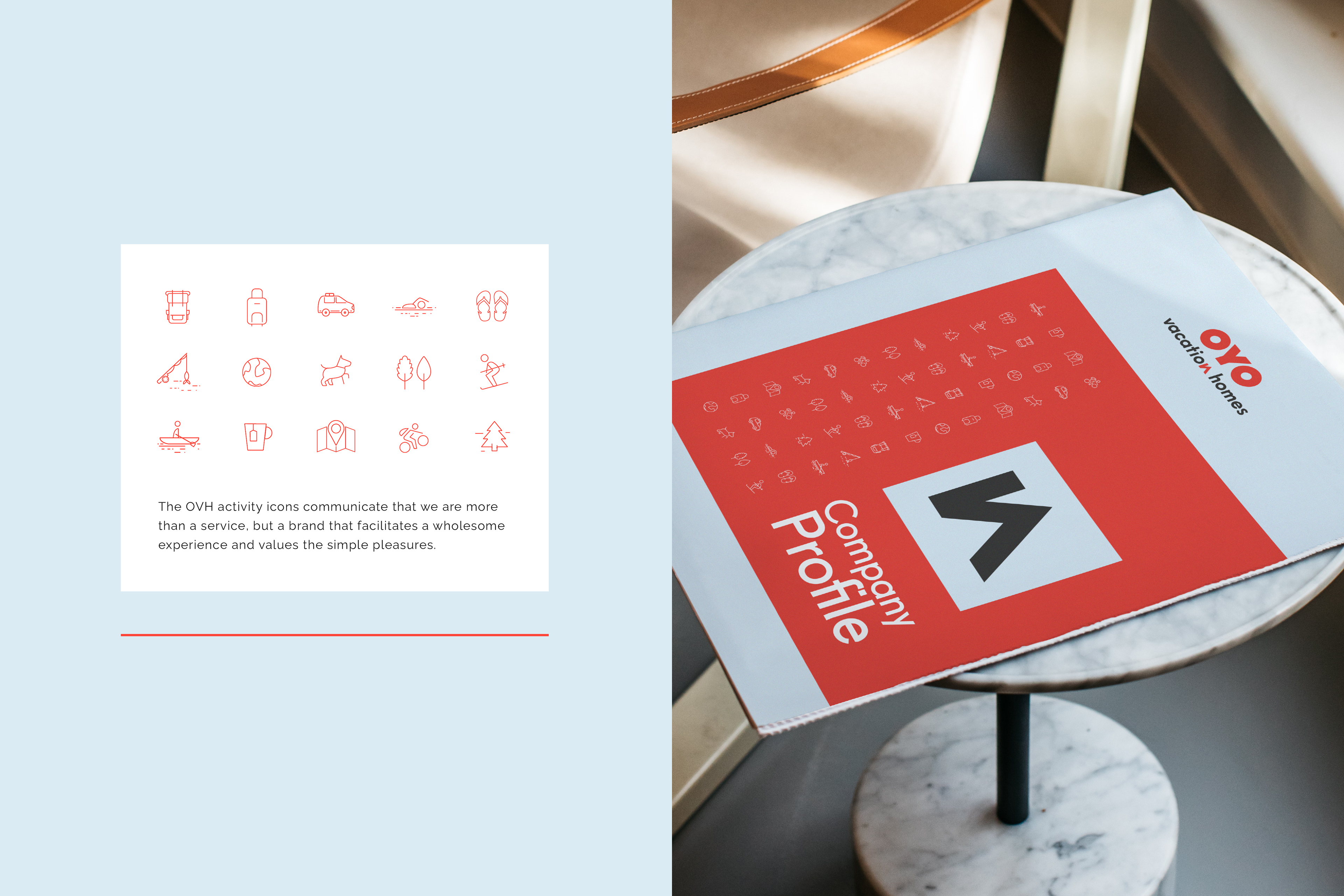
OYO being the overarching company with red as it’s primary colour it was clear to use a tone of red as well as including a softer light blue which reflected the previous company. Within the typography of the logo an icon emerges in a shape of a home which is then magnified to be used alongside other graphic elements. Icons where created to highlight all of the different activities that surround the holiday homes. All of these elements are used in a combination to form a system.